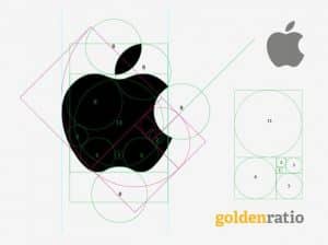
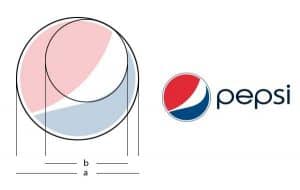
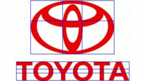
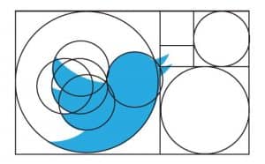
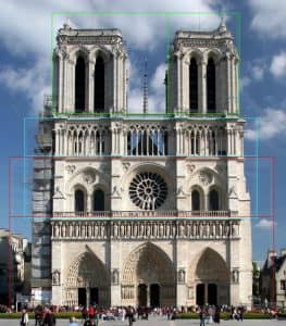
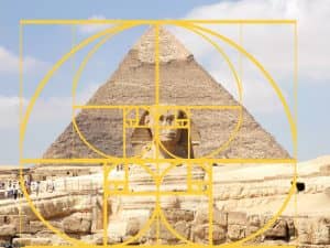
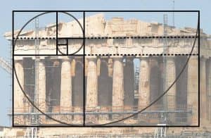
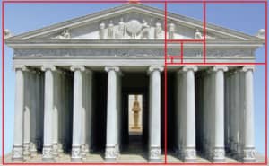
The Golden Ratio, also known as the Divine Proportion or Phi, is a mathematical ratio of 1:1.618 that is found in nature and has been used in art and design for centuries. When applied to logo design, the Golden Ratio can create a visually pleasing and harmonious design that is balanced and proportional. Here are some tips for designing a logo using the Golden Ratio:
Start with a grid: To use the Golden Ratio in logo design, start with a grid that is divided into a series of squares and rectangles in proportion to the ratio. This will provide a framework for creating a balanced and proportional design.
Use the ratio to guide placement: Use the ratio to guide the placement of elements in the design, such as the size and position of the text and graphical elements. For example, the ratio can be used to determine the size of a symbol or icon in relation to the text.
Create symmetry: The Golden Ratio can be used to create symmetry in the design, such as aligning elements along the grid or using the ratio to determine the spacing between elements.
Simplify the design: To create a clean and minimalist design, use the Golden Ratio to simplify the design and remove any unnecessary elements or clutter.
Test the design: Once the design is complete, test it in various contexts to ensure that it effectively communicates the brand’s message and works well in various sizes and formats.
By using the Golden Ratio in logo design, you can create a visually pleasing and harmonious design that is balanced and proportional. A professional logo designer can help apply the Golden Ratio to create a high-quality logo that effectively represents the brand’s identity and values.


 Chat with us